The 5-Second Website Test: Does Your Homepage Pass?
Visitors decide in about five seconds whether to stay on your website or leave. Here is a simple test to check if your homepage passes, and exactly how to fix it if it does not.
You do not have a traffic problem as often as you think. You have a clarity problem. Most websites lose visitors in the first few seconds, long before anyone reads a word of the carefully written About page. The good news is that this is one of the easiest things to fix, and you do not need a redesign to do it.
In this guide you will learn exactly what the 5-second test is, why most homepages fail it, and the three specific, no-cost changes that make yours pass. Everything here is something you can apply to your own site today, whether you built it yourself or paid someone to build it.
What is the 5-second test?
When someone lands on your homepage, they subconsciously decide within about five seconds whether your site is worth their time. This is not a made-up rule. It matches how people actually browse: they scan, they judge, and they leave the moment a page feels irrelevant or confusing. In those five seconds, a visitor is trying to answer three questions:
- 1.What do you do? (Is this a dentist, a SaaS tool, a bakery, a developer?)
- 2.Is it for me? (Do you serve my problem, my city, my kind of business?)
- 3.What do I do next? (Book, buy, call, sign up?)
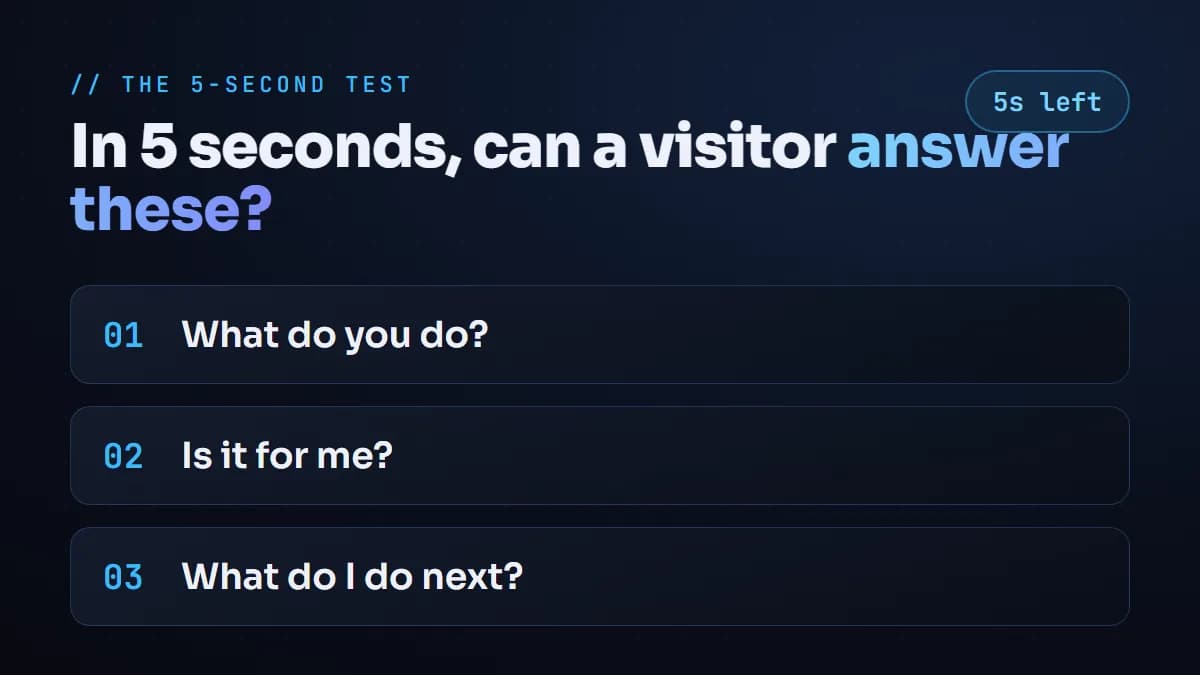
If your homepage answers all three clearly, the visitor stays. If it answers none of them, they hit the back button and you never hear from them. Try it right now: open your own homepage, count to five, and ask whether a stranger would know all three answers.
Ask a friend who knows nothing about your business to look at your homepage for five seconds, then close it and tell you what you do. If they cannot, your first screen needs work.
Why most homepages fail
The most common mistake is opening with a vague, self-focused headline and a rotating slideshow. Lines like 'Welcome to our website' or 'Excellence in everything we do' say nothing about what the visitor gets. They are about you, not about them.
The second common mistake is offering too many choices. A navigation bar with Home, About, Services, Portfolio, Blog, Careers and Contact, all competing for attention, leaves the visitor unsure what to click. Confused visitors do not convert. They leave.
How to fix your first screen
You can fix the 5-second test with three changes, and none of them require a full redesign.
1. Write a headline that says what you do and for whom
Your main headline is the most valuable text on your entire site. Make it specific.
| Weak headline | Strong headline |
|---|---|
| Welcome to our website | Affordable dental care for families in Delhi |
| We deliver excellence | We build fast websites that rank on Google and AI search |
| Your trusted partner | Bookkeeping for small US e-commerce brands |
Notice how the strong versions instantly answer 'what do you do' and 'is it for me'. A visitor knows in one line whether they are in the right place.
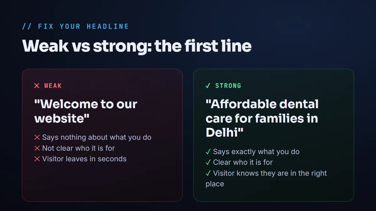
A quick way to write a strong headline: finish the sentence 'I help [who] to [do what]'. 'I help families in Delhi get affordable dental care' becomes your headline almost word for word. If you cannot finish that sentence clearly, that is a positioning problem worth solving before you touch the design.
2. Use one clear call-to-action
Decide the single most important action a visitor should take, and make that button impossible to miss. 'Book an appointment', 'Get a free quote', or 'Start free trial' each tell the visitor exactly what happens next. You can still have a menu, but the primary button should stand out and repeat down the page.
3. Add proof right below the headline
Trust is built fast with specifics. A single line of proof under your headline reassures the visitor that other people already chose you. Use whatever is true for your business:
- •A number: '500+ happy patients' or 'Trusted by 40 businesses'.
- •A result: 'We grew a client's traffic 3x in 90 days'.
- •Logos: recognizable clients or partners you have worked with.
- •A short review: one strong sentence from a real customer.
You do not need a redesign. You need clarity. Clear beats clever every time on a homepage.
Do not forget mobile
More than half of your visitors are on a phone, so the 5-second test really happens on a small screen first. A headline that looks great on a laptop can push your button below the fold on mobile, where nobody scrolls to find it. Open your site on your own phone and run the same test. If the first thing you see is a giant logo and a hamburger menu instead of a clear message and a button, that is a problem worth fixing.
- •Keep your headline short enough to read at a glance on a phone.
- •Make sure the main button is visible without scrolling.
- •Check that text is large enough to read without zooming.
- •Test load speed on mobile data, not just fast office wifi.
Common mistakes that fail the test
Beyond a vague headline and too many buttons, these are the patterns that quietly cost you visitors:
| Mistake | Why it fails | Quick fix |
|---|---|---|
| Auto-playing slideshow | Visitor cannot read a message that keeps moving | Replace with one static headline and image |
| Jargon or clever taglines | Nobody knows what you actually do | Say it plainly, cleverness comes second |
| No clear next step | Interested visitors do not know what to do | Add one obvious primary button |
| Slow load | Visitor leaves before the page appears | Compress images, test on PageSpeed Insights |
| Hidden contact info | Ready-to-buy visitors give up | Show a way to contact you up top |
A quick before-and-after
Imagine a freelance photographer whose homepage opens with 'Capturing moments since 2015' and a slideshow. A visitor has no idea what kind of photography, for whom, or how to book. Now imagine it opens with 'Wedding photography for couples in Mumbai', a button that says 'Check my availability', and a line reading '120+ weddings shot, 5-star rated'. Same photographer, same skills. The second version passes the 5-second test and books more clients.
The takeaway
Before you spend money on more ads or a bigger redesign, fix the first five seconds. Make your headline specific, give visitors one clear next step, and show proof they can trust. It is the cheapest, fastest improvement most websites can make, and it is usually the difference between a site that looks nice and a site that actually brings in work.
Frequently asked questions
How long do I really have to make an impression?+
Studies of user behaviour consistently show visitors form a first impression within a few seconds, often under five. That is why the top of your homepage matters more than any other section.
Do I need to redesign my whole website to pass the test?+
No. In most cases you only need to rewrite the main headline, simplify to one clear call-to-action, and add a line of proof. These are content changes, not a rebuild.
What is the single most important fix?+
The headline. Replacing a vague 'Welcome' style headline with a specific one that says what you do and who it is for is usually the highest-impact change you can make.
How do I test my homepage objectively?+
Show it to someone unfamiliar with your business for five seconds, then hide it and ask them what you do, who it is for, and what they would click. If they cannot answer, your first screen needs work.
Read next
I build fast, SEO-ready sites and rank them on Google and AI search. Or join my free community and grow alongside other website owners.